Star & Crescent Eating Club
May 2023
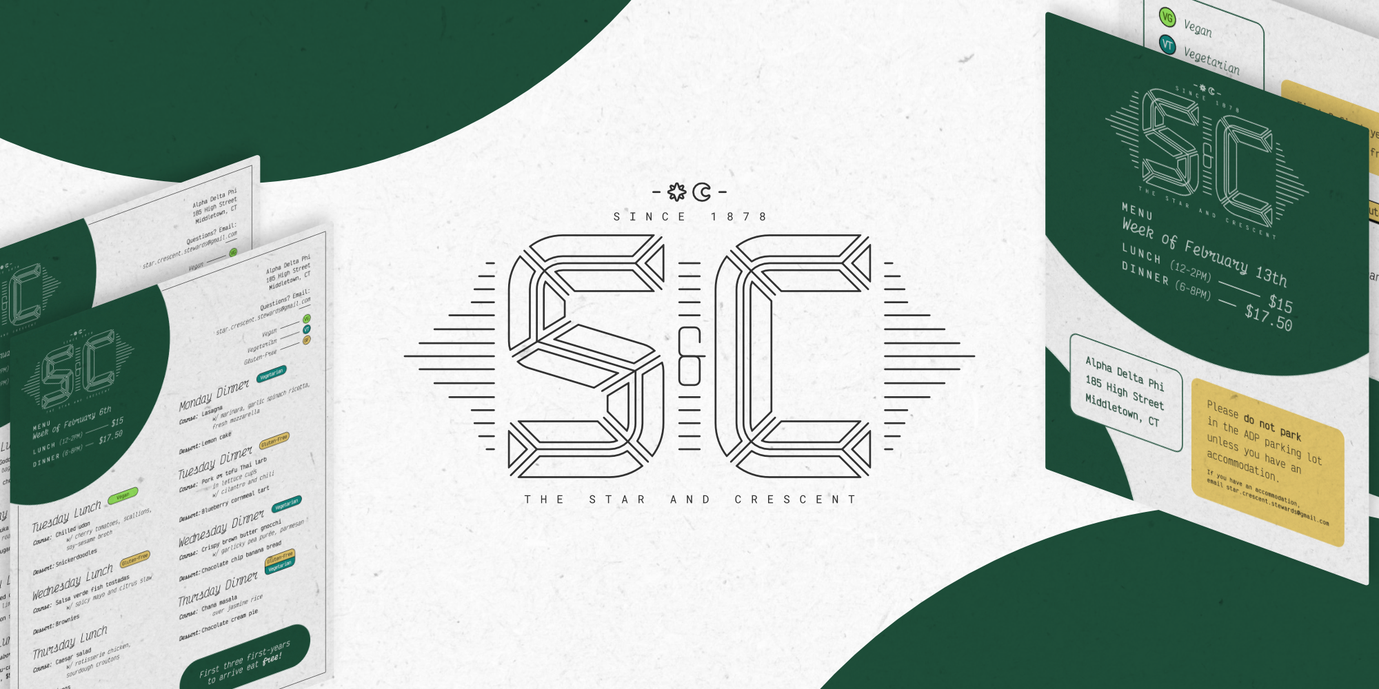
Digital weekly menus and branding
For the 2022-2023 academic year, I was the graphic designer for Star & Crescent, Wesleyan University’s premier on-campus eating club. I refactored their brand around the logo and created digitally distributed menus with an eye towards classiness without pretense.
The priority of my branding design was clarity, and this intention dictated nearly every choice. The S&C logo includes fine details and tiny additional type, so I designed a simplified version suitable for use at small sizes.

Victor Mono, an airy monospace font with optionally ornamented italics, was my choice for the menus’ type hierarchy. Distinguishing between primary and secondary text was especially critical: menu items were often long, and separating the main idea from its ingredient list kept everything easy to parse.

S&C hosted a diverse menu that catered to vegetarian, vegan, and gluten-free eating habits alike; often, these were optional modifications of standard menu items. Extending the brand’s standard green to include a range of earthy colors, I developed a “badge” system, making it easy to understand complex qualities like “vegetarian by default, but with a vegan option”*at a glance.
Menu samples
Below, find three menu samples: two in a standard “printable” format and one in a digital gallery format.
By halfway through the semester, S&C was exclusively distributing their menus via Instagram. I took advantage of this by splitting the content across six slides, which vastly improved legibility.


