Vote Line A - 2019-2021
May 2019 - September 2021
Digital and print identity for local politics
For their 2019 and 2021 campaigns, the Ridgefield Democratic Town Committee hired me as graphic designer. My task was to create campaign print materials, posters, and web assets.
2019
My approach was to collaborate with DTC members on a brand identity, including a recognizable color palette and type design as well as a handful of slogans and taglines. We darkened the Democratic Party blue to a rich navy for legibility, and generated a library of text boxes with subtle dimensionality and depth. Both these modal elements and our choice of typeface – Barlow – are pleasingly geometric but subtly personal.
The resulting print materials are confident, eye-catching, and ever-so-slightly playful.


When designing lawn signs, we expanded the color palette to a range of dark, cool colors. Were the signs monochromatic, a viewer might glance over a sign they hadn’t seen before, thinking it already seen.
2021
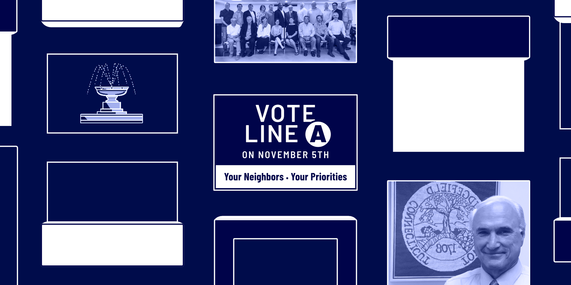
My 2021 refinement of Vote Line A doubled down on its tessellated elements and re-emphasized the Ridgefield DTC logo.

I replaced the Barlow typeface with a pair – one friendly, one classy – that accompany each other in the type hierarchy. This allowed the new print materials to feature consistently large, distance-viewable text that is still visually distinct.
The print materials’ principally white background enhances legibility for visually imparired constituents, while subtle “sticker” shadows restore visual depth and tastefully delineate between neighboring elements.
I updated the lawn signs with the same new typeface, but with a lighter weight to compensate for the text’s smaller size. Now, the signs are visually differentiated by not only their background color but their tile layout; consistency is maintained by the tagline and prominent logo.
This fountain icon is not my design, but I recreated and refined it for use in this campaign, fixing subtle asymmetries and inconsistencies in stroke weight.